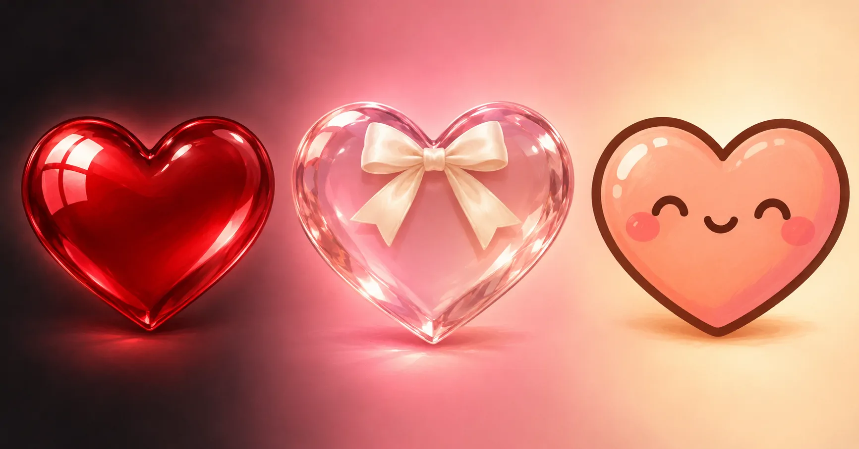

Looking for a Heart PFP with a soft, aesthetic feel? This collection brings together 48 ideas, from simple symbols to smiling heart characters. Explore pink, red, cute, black, broken, Y2K, and matching styles. Each group offers a different balance of colour, texture, and mood.
Choose blush and cream for a gentle profile, or try crimson against black for stronger contrast. Small faces and rounded shapes give cute heart icons a friendly look. Cracks, silver edges, and darker backgrounds create a quieter mood without hiding the main shape.
These heart profile pictures suit Discord chats, Instagram comments, TikTok accounts, and WhatsApp contacts. Start with the colour you already enjoy wearing or using. Then compare each design at a small size, where a clear outline matters more than tiny decoration.
Editor’s Favourites
These Heart PFP ideas cover soft pink, bold red, cute characters, dark gloss, broken shapes, and silver Y2K shine. Each keeps one clear subject near the centre.


Pink Heart PFP
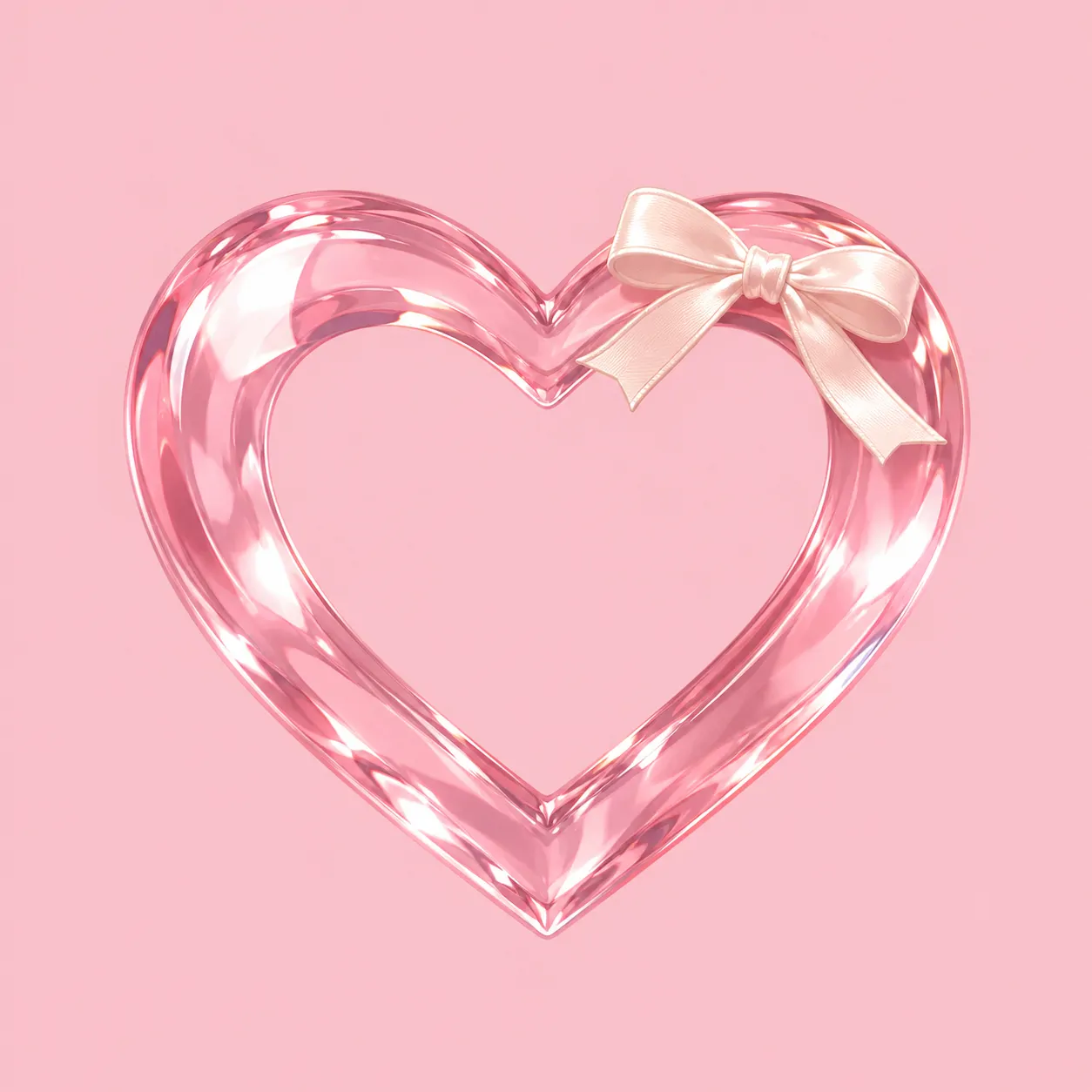
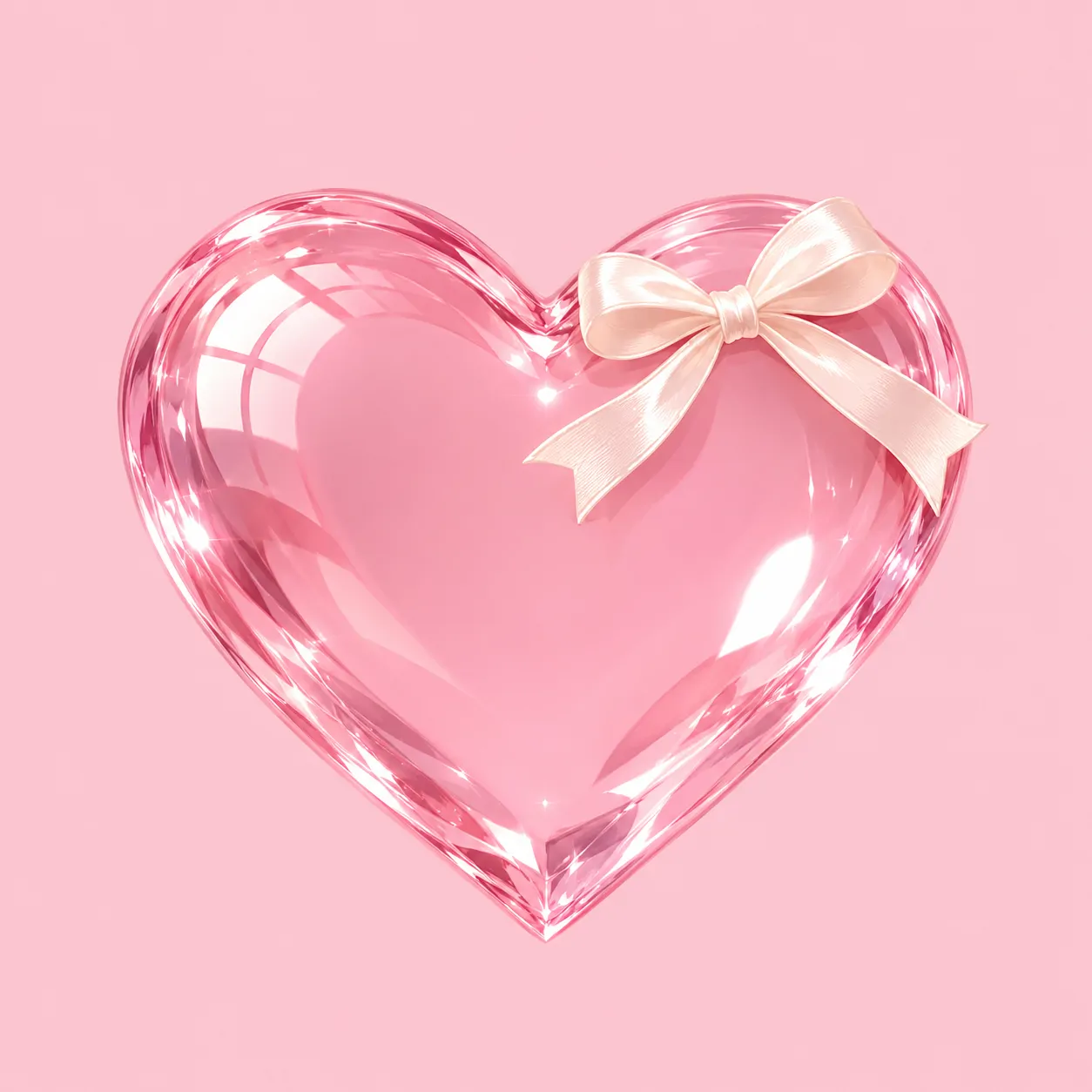
Pink Heart PFP designs bring together blush glass, satin, pearl, and simple illustrated shapes. These six ideas keep pink as the main colour without repeating one texture.
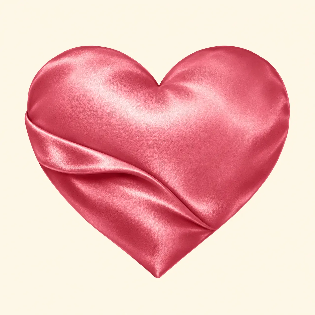
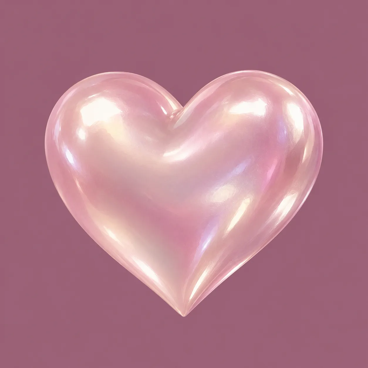


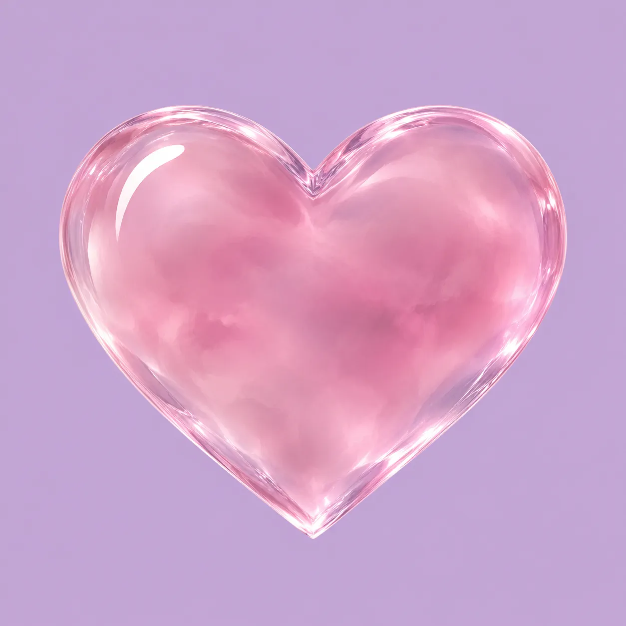
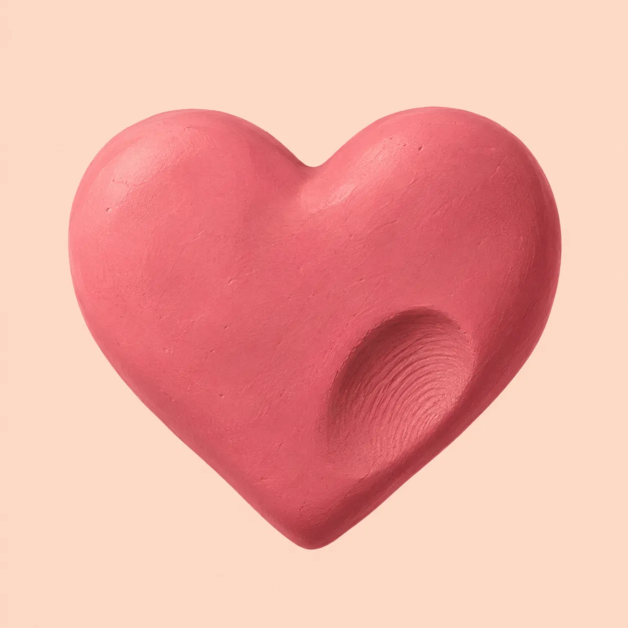
Blush, rose, and bubblegum pink create noticeably different results, even with the same heart shape. Blush sits gently beside ivory, while bubblegum needs a quieter background. Dusty rose works well with mauve because the colours share a muted feel without blending into one flat patch.
A Pink Heart PFP does not need flowers or extra symbols to feel soft. Satin folds, frosted glass, and a single ribbon already change its character. This set gives you smooth, cloudy, fabric, and handmade surfaces while keeping the central shape easy to recognise.
Use the background to control how sweet the picture feels. Cream adds warmth, lilac feels cooler, and deeper mauve gives pale pink more definition. Before saving, shrink your favourite on screen and check that its upper curves remain separate from the background.
Red Heart PFP
Red Heart PFP ideas use cherry, scarlet, and burgundy tones with clear backgrounds. The six designs range from a flat symbol to glass, velvet, and neon.

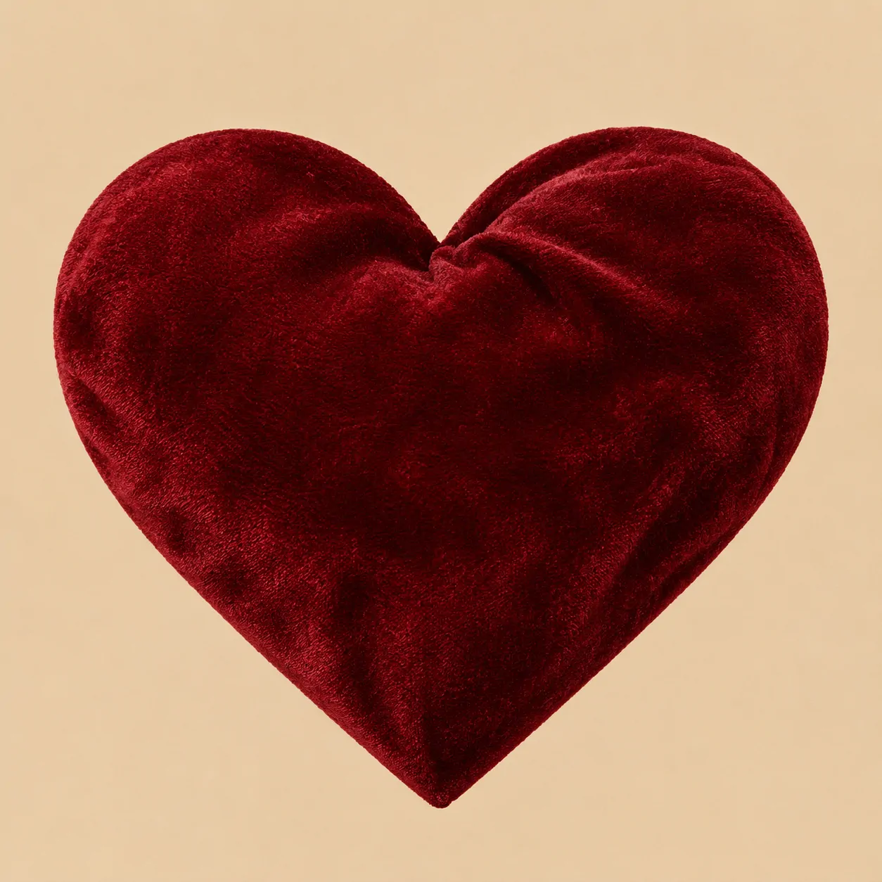
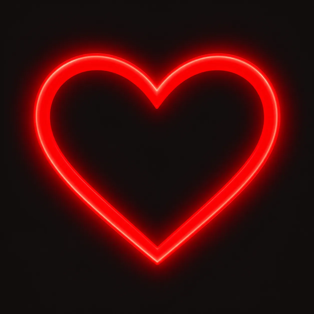
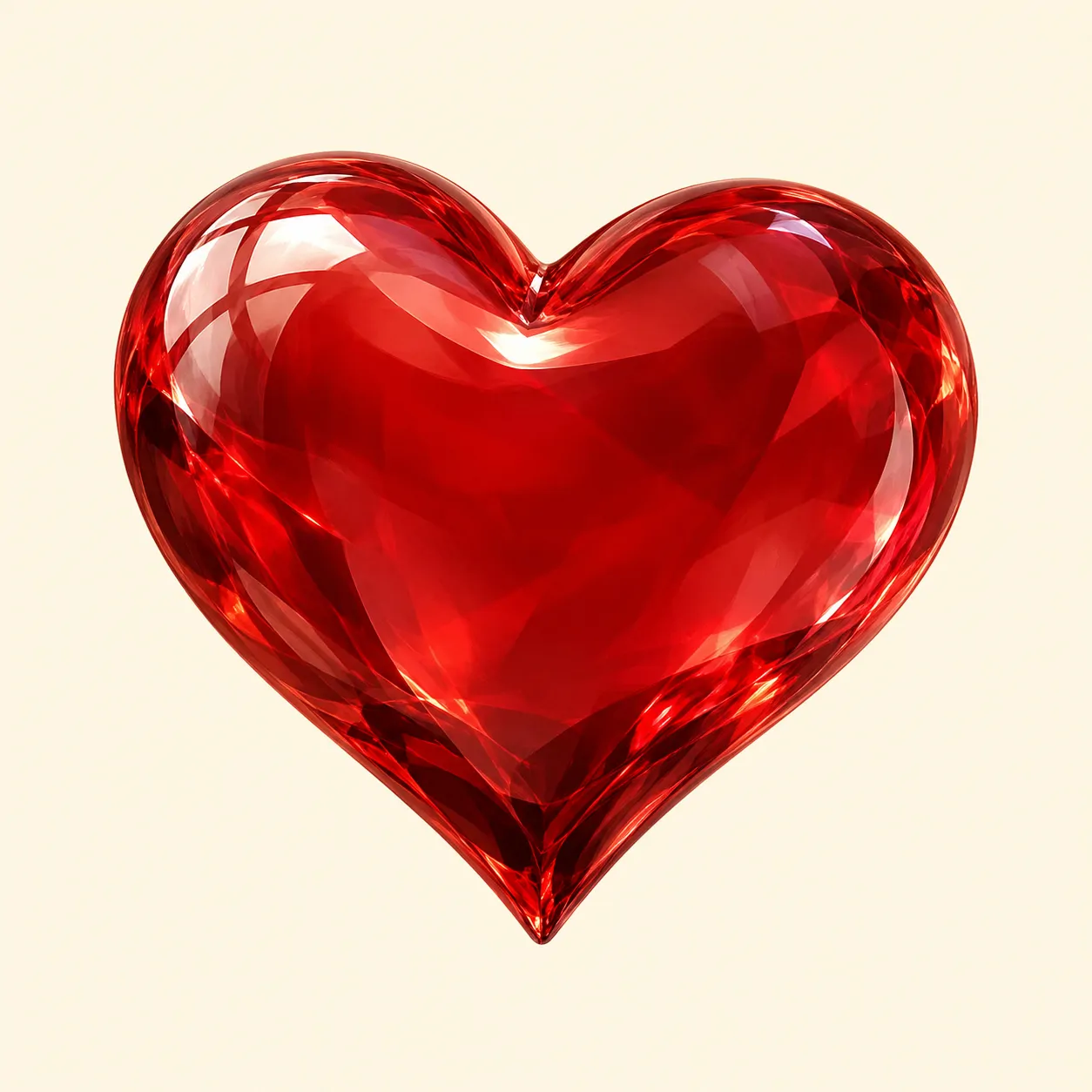
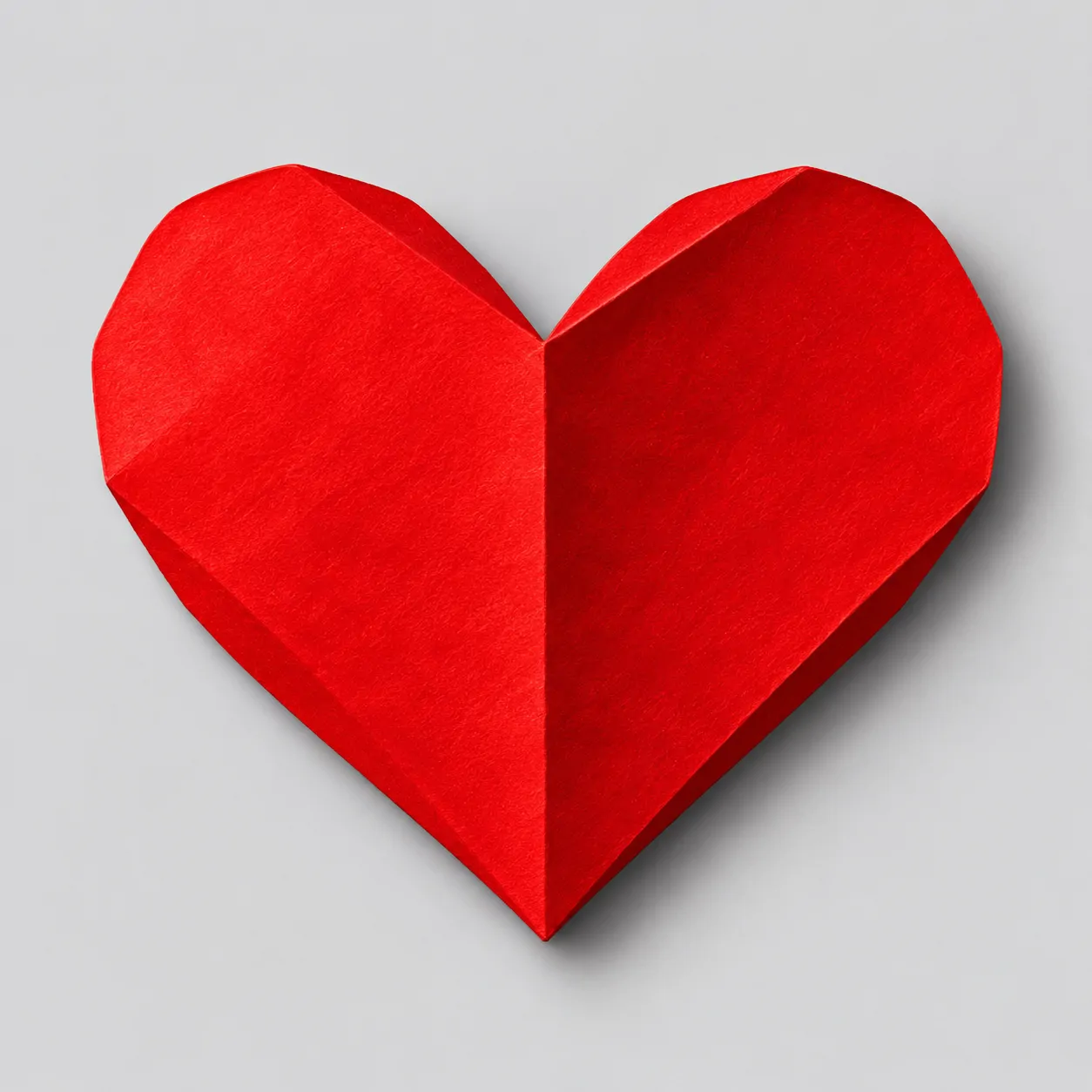
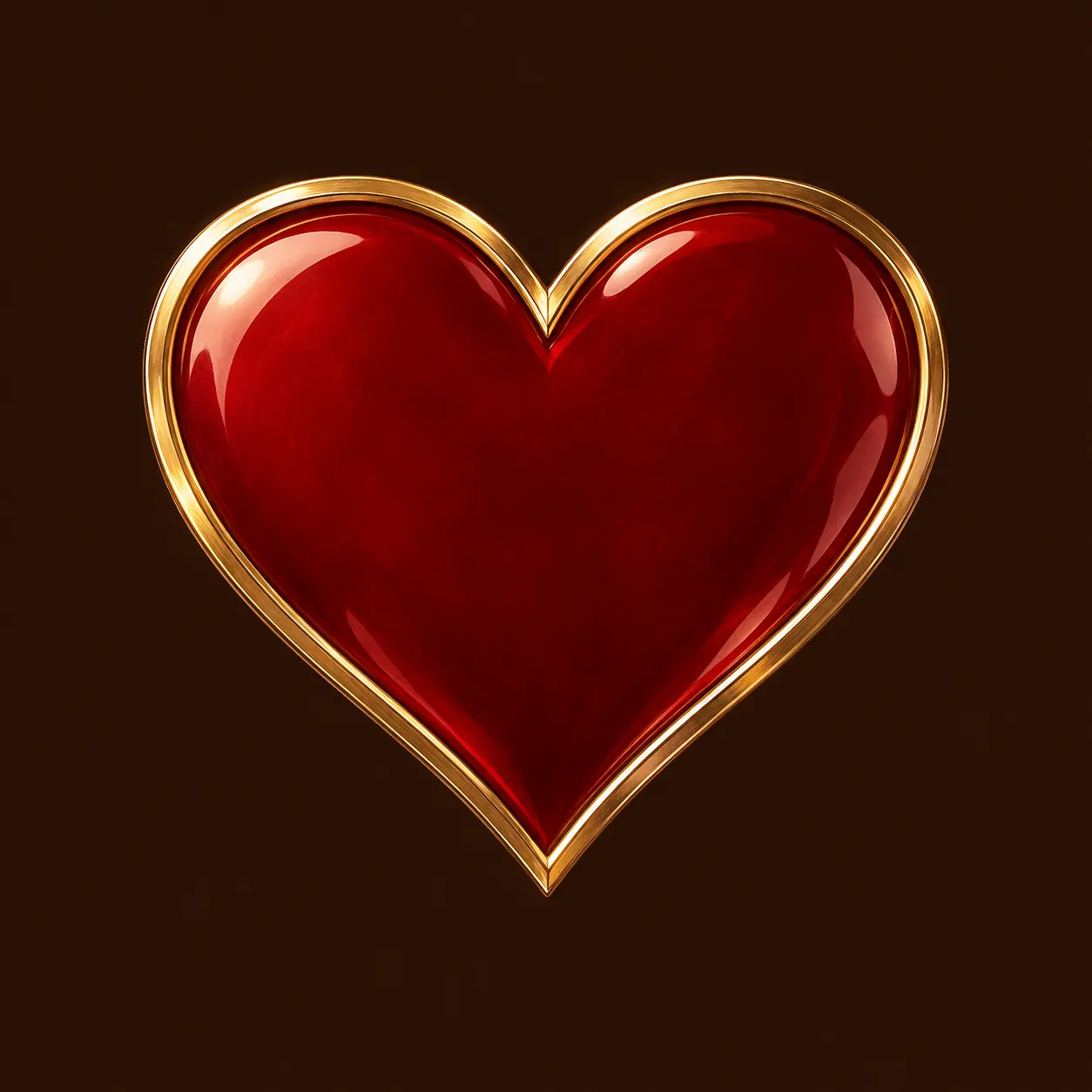
Red can feel bright, warm, or restrained depending on its shade. Scarlet leans towards orange, while burgundy has a deeper, darker appearance. White gives either shade a clean edge, and charcoal makes glowing red lines easier to see without adding more colours.
Choose a Red Heart PFP with a broad shape if you prefer a direct, simple symbol. The flat cherry design is clear at a glance. Velvet and enamel offer a more textured alternative, while folded paper introduces one strong line instead of many small details.
A dark background needs enough contrast around the lower point and upper notch. Check those areas before choosing between burgundy velvet and ruby glass. If your banner already uses red, try a quieter cream or grey behind the heart to avoid a crowded profile.
Cute Heart PFP
Cute Heart PFP designs add friendly expressions, rounded cheeks, and small comforting details. This group includes smiling heart mascots and two cats holding complete heart shapes.

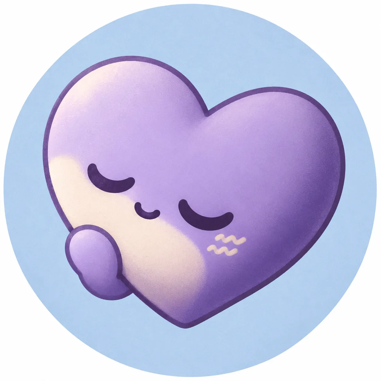
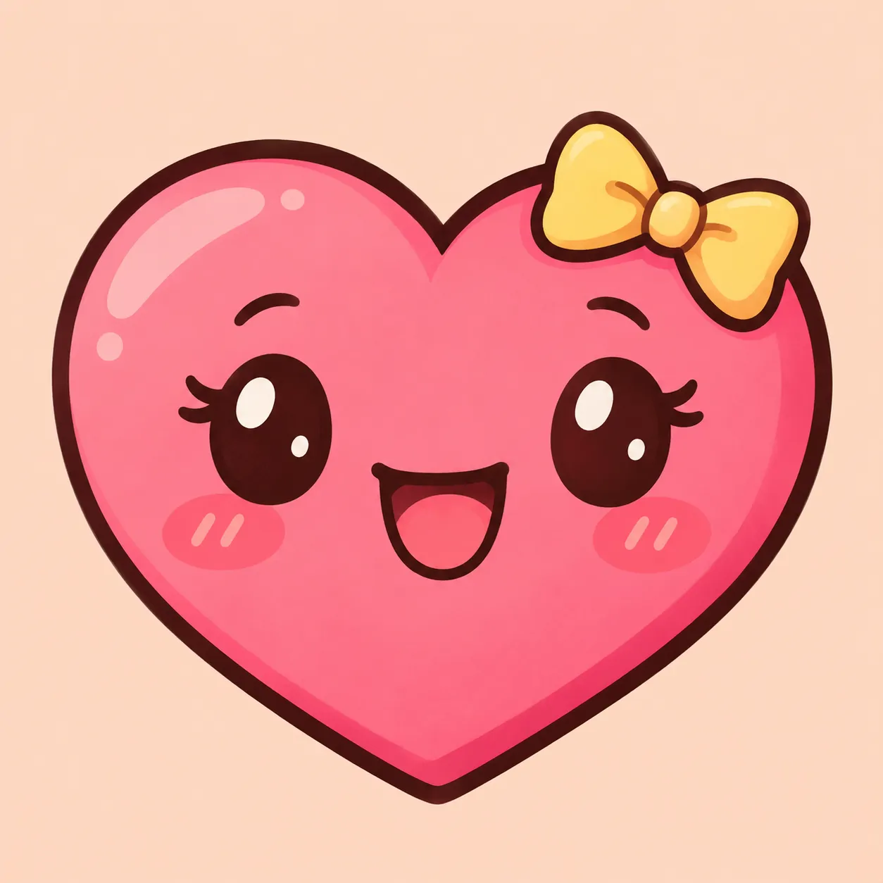



Small expressions do much of the work in this group. One wink feels lively, while closed eyes feel restful. Rounded cheeks and short curved mouths keep the faces friendly. Thick outlines also separate the features more clearly than many tiny lines would.
The Cute Heart PFP set includes coral, lavender, pink, and mint mascots with different gestures. The cats offer another choice without losing the heart theme. Their paws hold the symbol close to the face, keeping both features together rather than spreading them across a larger scene.
Choose the expression before choosing the background colour. A sleepy face suits a calm account, while a wide smile feels more open. Keep bows and hands smaller than the face, and avoid adding extra stickers that could hide the heart’s outline.
Black Heart PFP
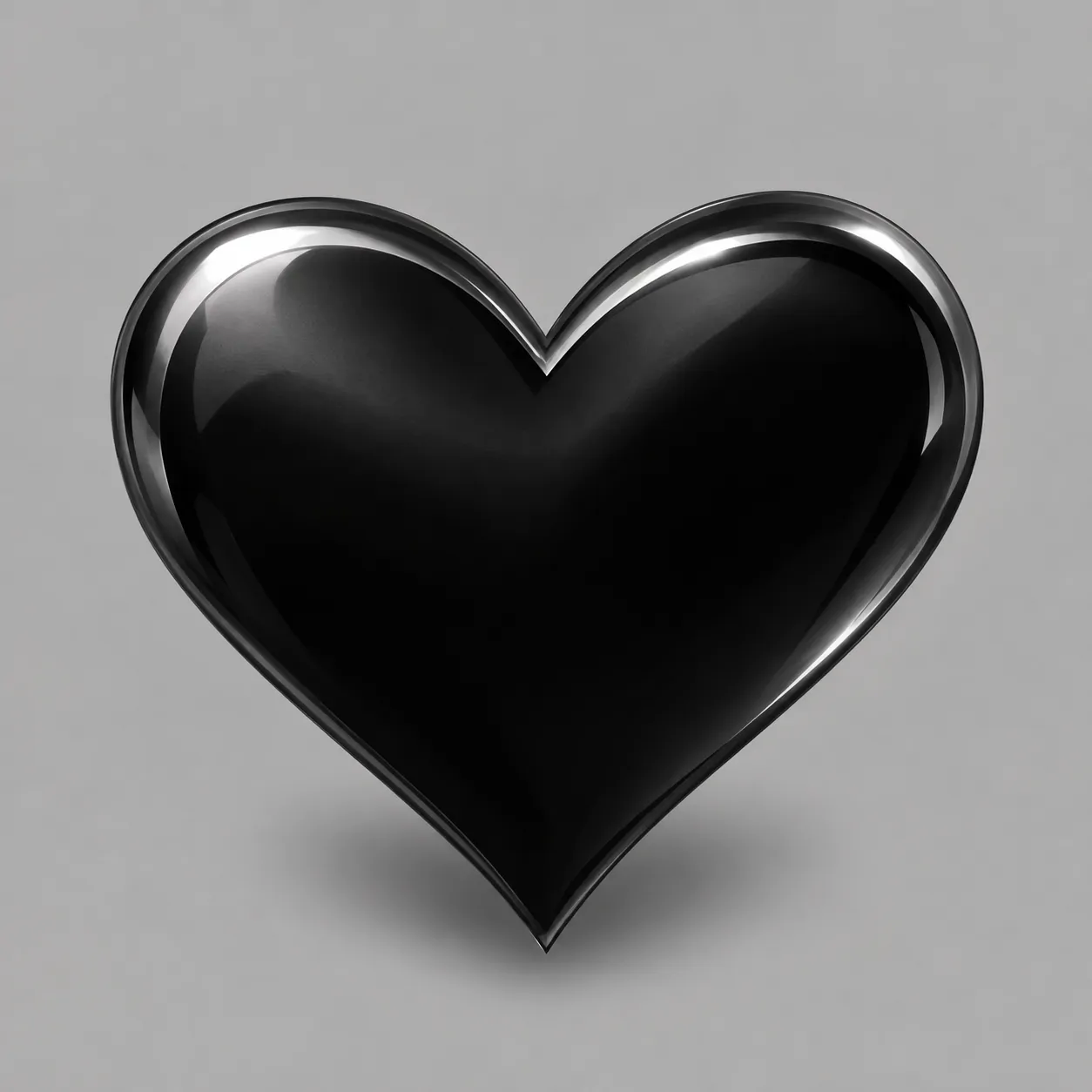
Black Heart PFP designs use pale backgrounds, silver reflections, and controlled red accents. Each keeps the dark heart visible rather than letting it disappear into surrounding shadows.

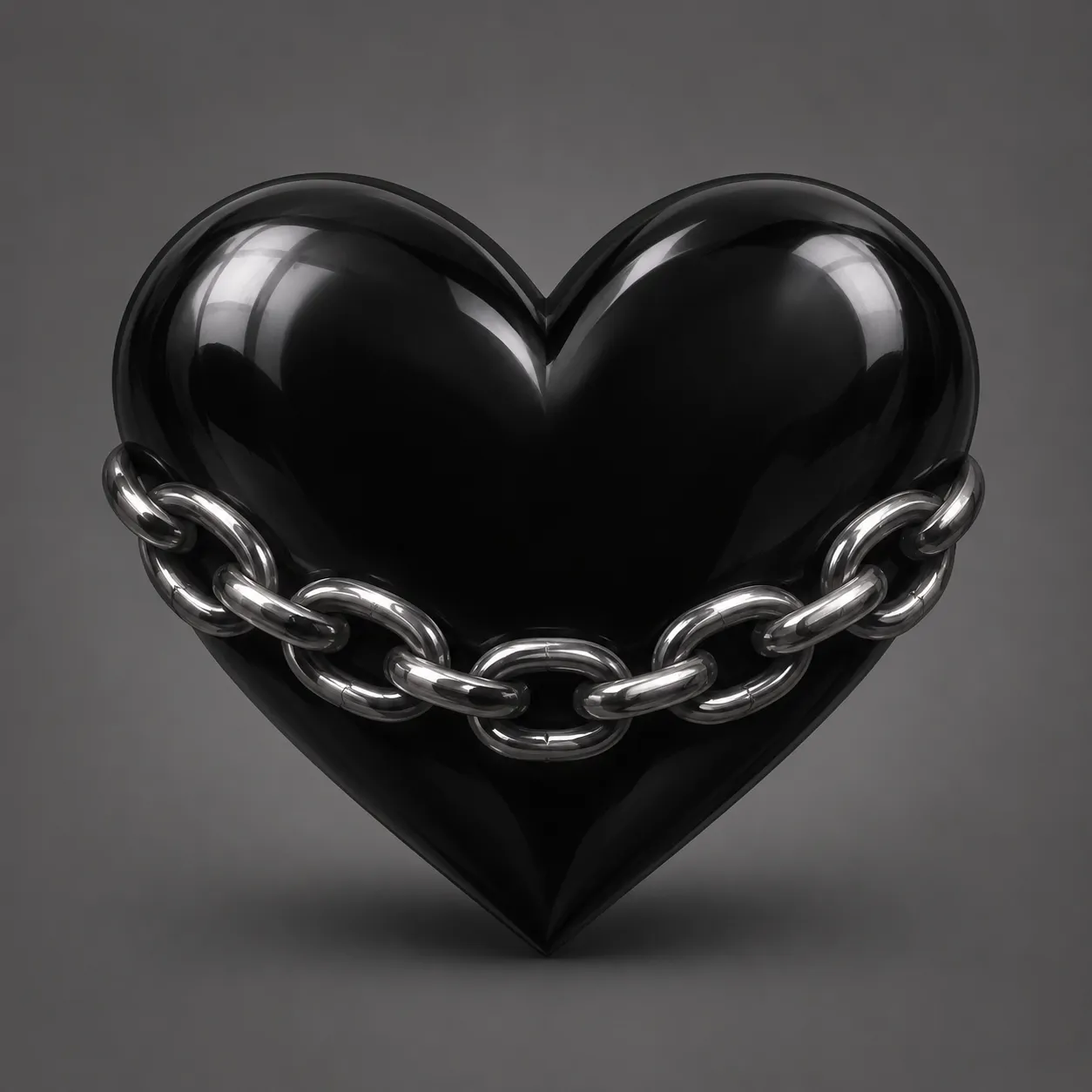
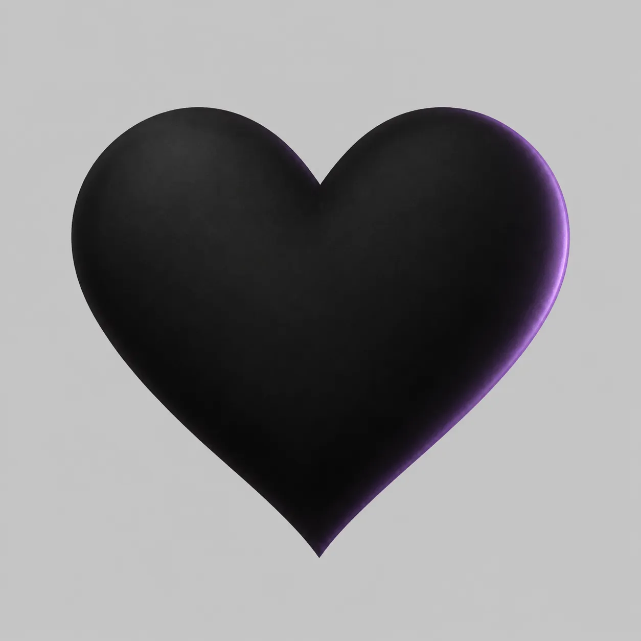
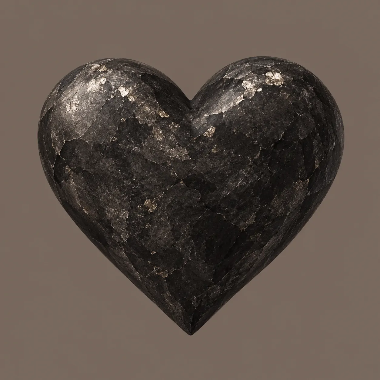
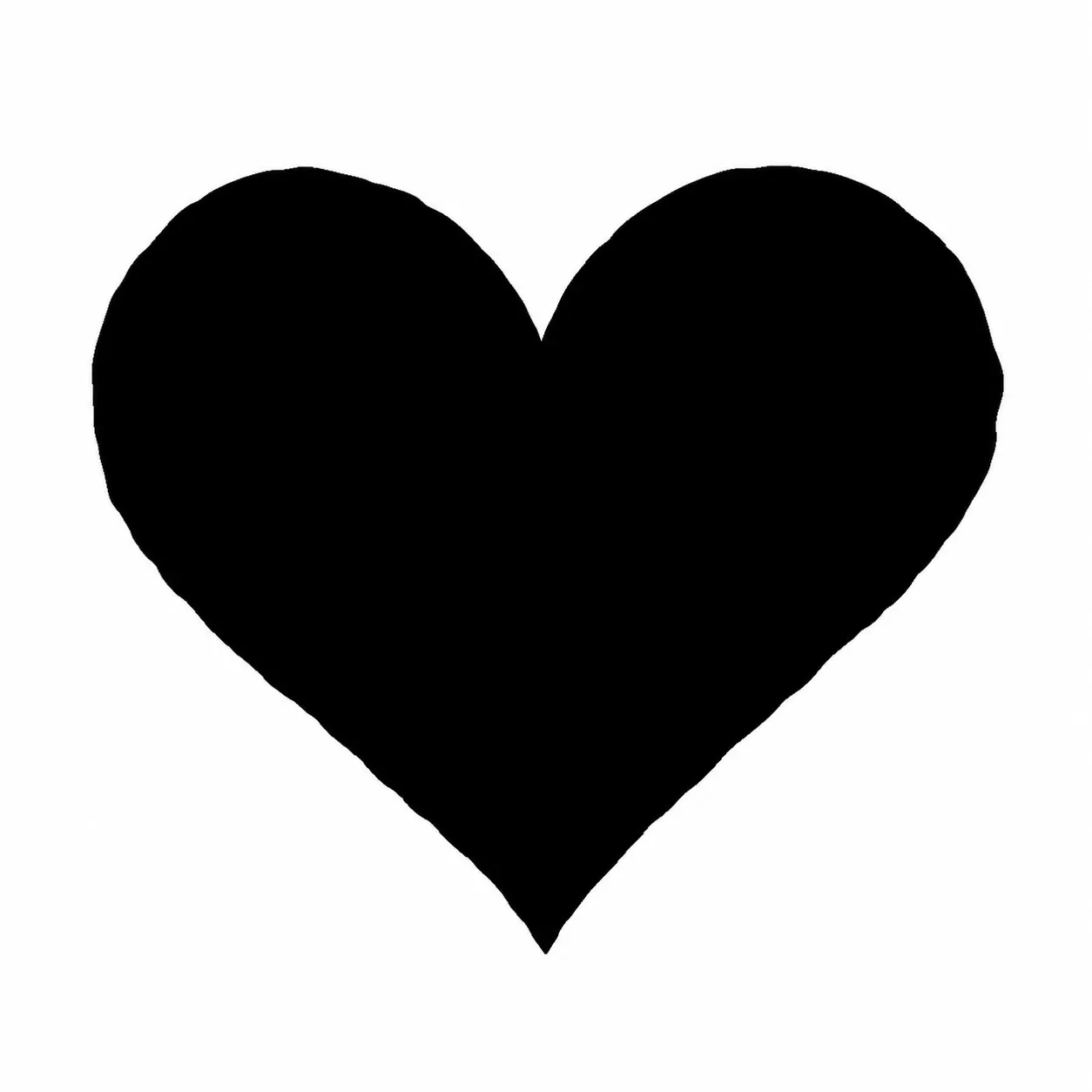
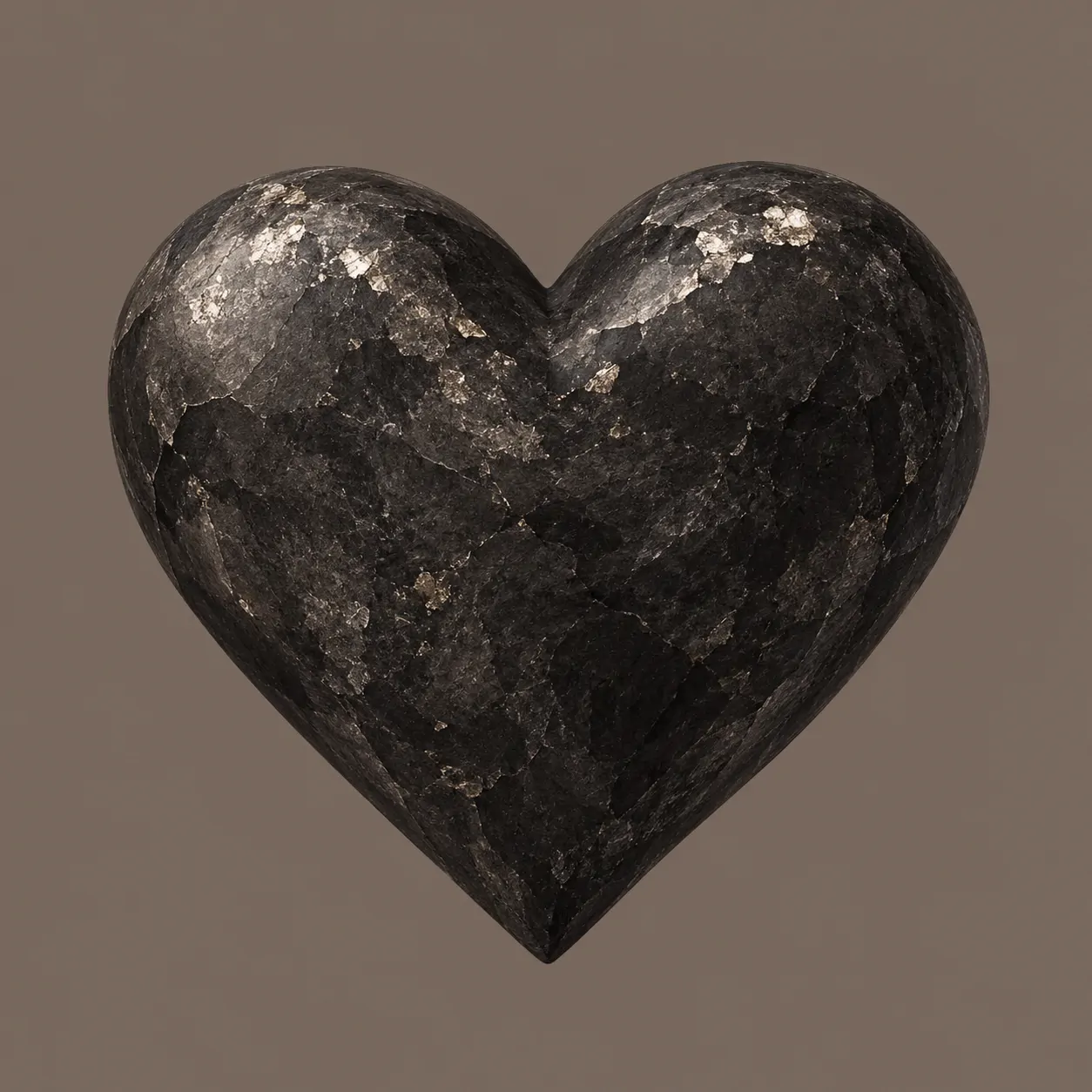
Black needs a clear edge more than extra decoration. A pale grey or ivory background makes the silhouette easy to follow. On charcoal, a silver or red reflection can define the same curves. Matte surfaces feel quieter, while gloss creates a stronger change between light and dark.
Your Black Heart PFP can stay minimal without looking unfinished. The ink version relies entirely on its outline, while the chain and stone designs add one controlled detail. Lilac edges offer a cooler choice than red reflections, especially beside grey or purple profile colours.
Test the darkest option against the interface you use most. If the heart merges with the surrounding page, choose a lighter background instead of adding more shine. A narrow highlight should reveal the symbol, not cover its centre or turn it into a silver heart.
Broken Heart PFP
Broken Heart PFP designs show cracks, repairs, and muted colour rather than dramatic scenes. These six complete heart symbols keep the damage readable at a small size.

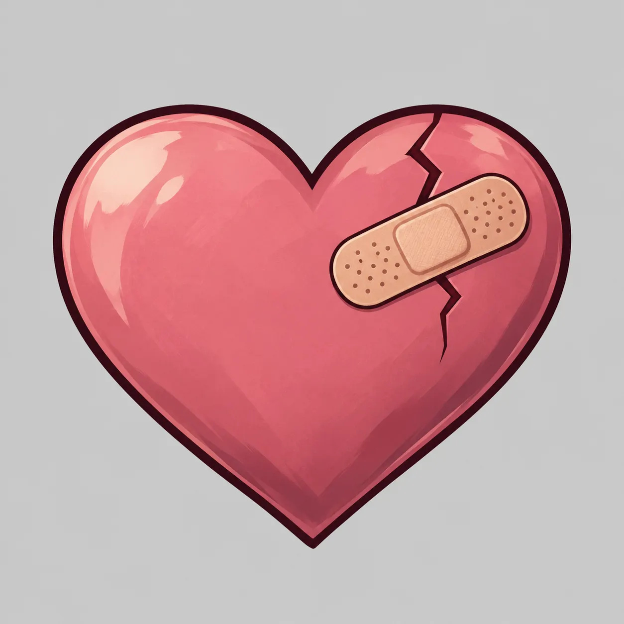

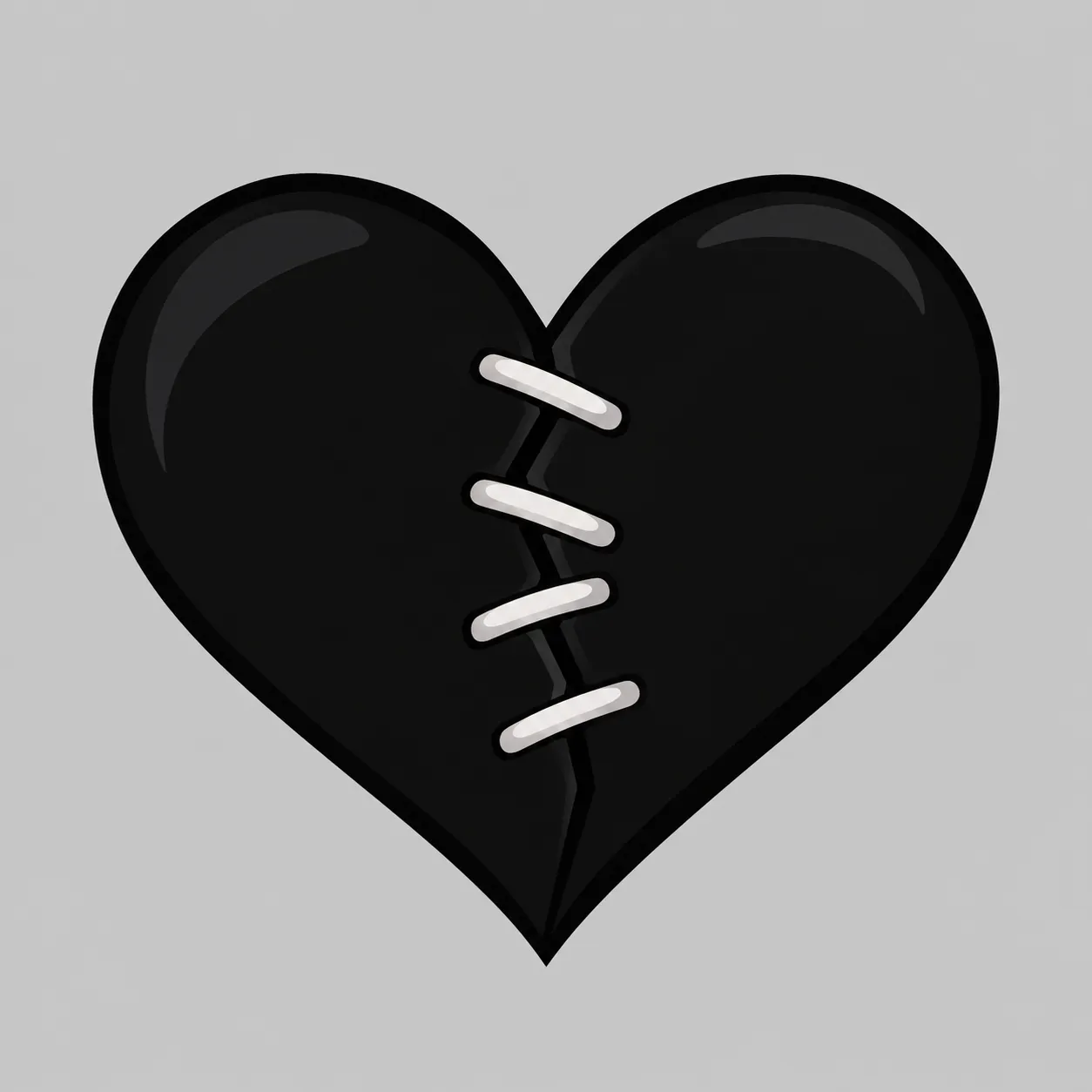


A crack changes the meaning of a familiar symbol without needing a face or a written message. Bandages, stitches, and tape shift the focus towards repair. Glass fractures feel different from torn paper because their sharper lines contrast with the heart’s rounded outer shape.
These Broken Heart PFP ideas use six distinct surfaces and repair details. Crimson and black create more contrast, while dusty pink and rose paper feel quieter. The designs avoid scattered fragments, keeping the heart complete enough to recognise quickly in a chat list or comment thread.
Pick a picture for its visual mood, not a fixed message you feel obliged to explain. Other people may read the symbol differently. If your profile already has a detailed banner, choose the single crack or bandage rather than combining rain, stitches, and several other effects.
Heart PFP Y2K
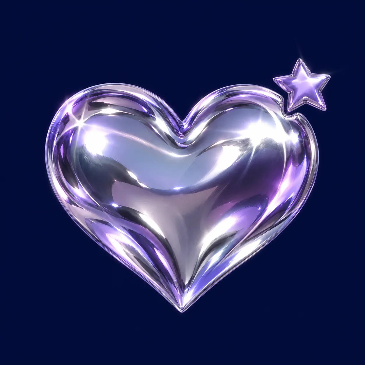
Heart PFP Y2K designs combine chrome, jelly colour, pixel edges, and small star accents. The central heart stays large while the early-digital details remain simple.


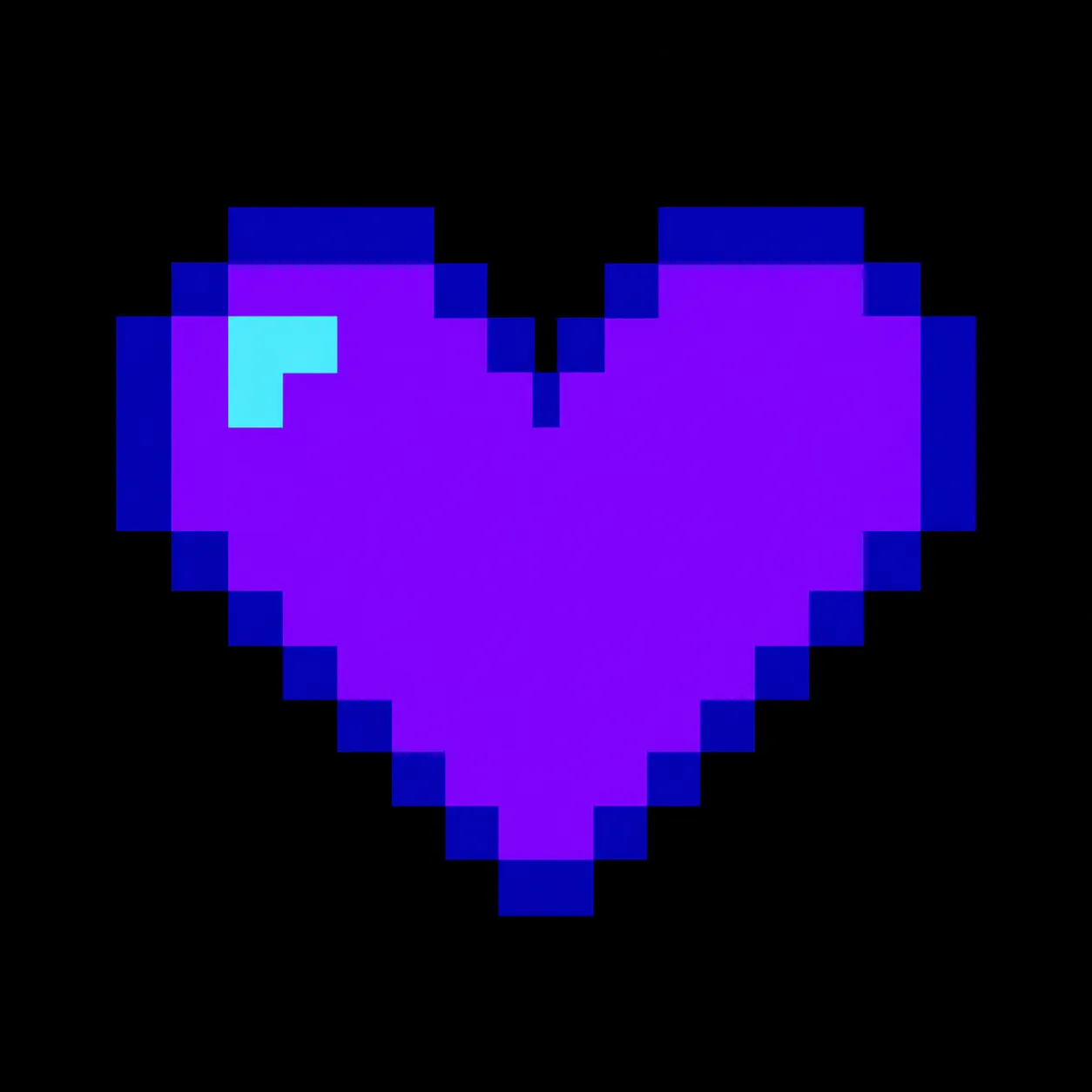
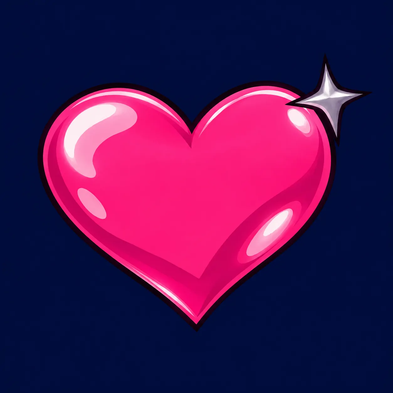
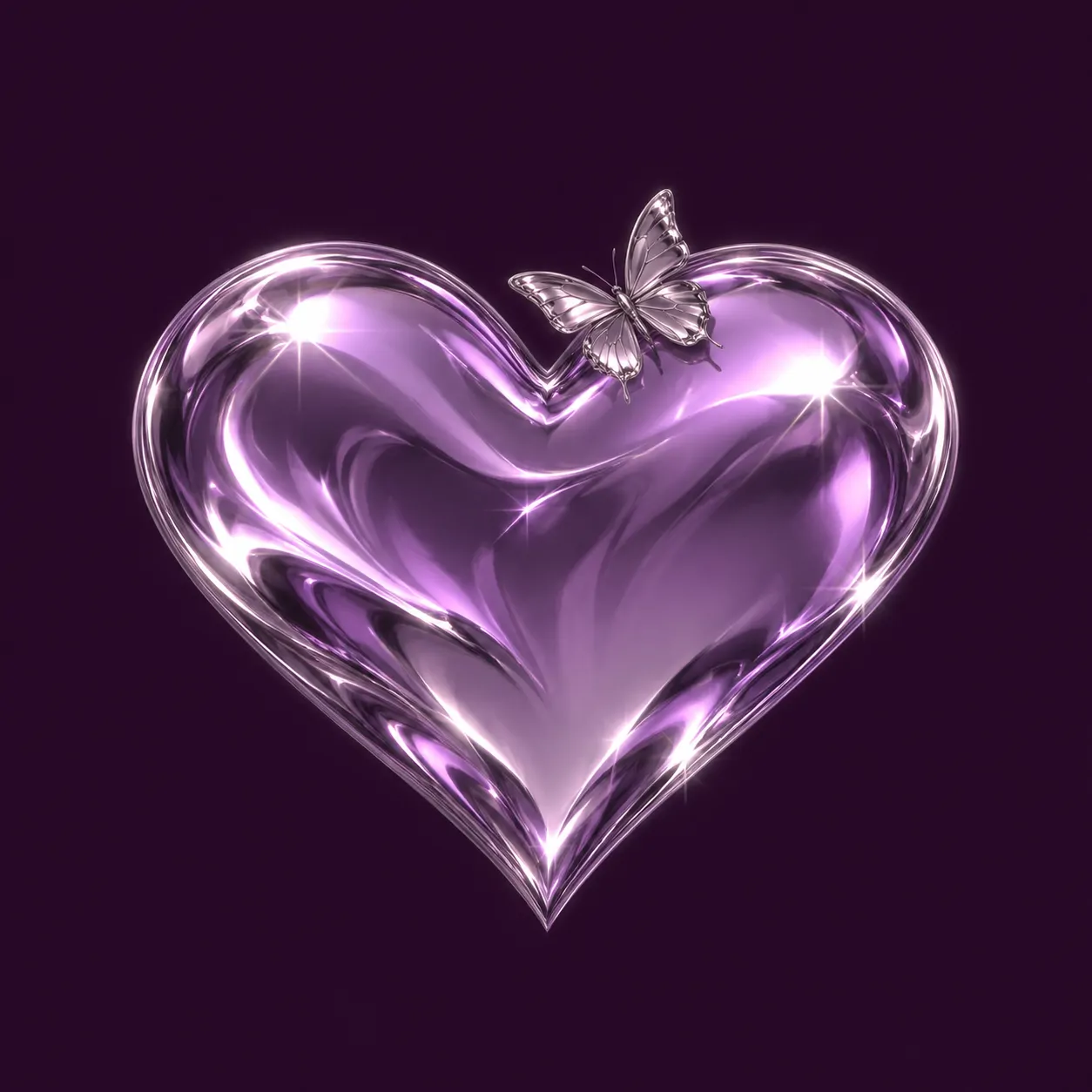

Y2K refers to the turn of the millennium, and its visual style often mixes shiny surfaces with early-digital details. Chrome, translucent jelly shapes, pixel steps, and four-point stars fit that language. A plain background helps these stronger surface effects remain separate and readable.
The Heart PFP Y2K set offers silver, hot pink, violet, and cobalt without changing the main subject. The pixel design uses hard steps instead of curved reflections. The butterfly and orbit versions add movement, while the jelly heart keeps its detail inside the symbol.
Let one effect lead. A chrome heart can carry a star, but several large accessories would compete with its reflections. Pair these pictures with a restrained banner in navy, plum, or icy blue. Keep the pixel heart’s stepped edges intact rather than smoothing them into a different style.
Matching Heart PFP
Matching Heart PFP designs connect two profiles through shared colour and mirrored details. These six pictures form three pairs, with one complete heart in every picture.
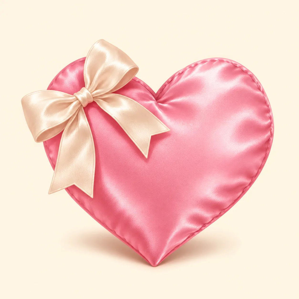
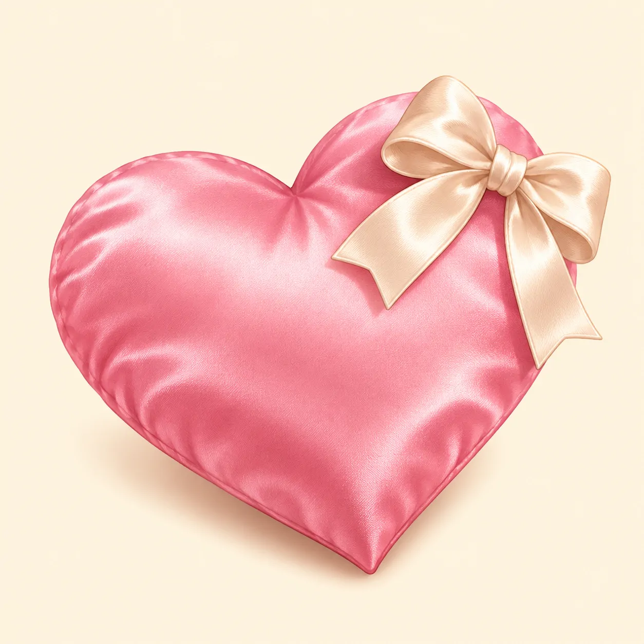




A shared palette can connect profiles without splitting a symbol between them. The first pair shares pink hearts with cream bows, the second shares chrome and lilac stars, and the third uses coral mascots. Each picture contains a whole subject that still makes sense by itself.
Choose a Matching Heart PFP pair based on the mood you both enjoy. Bows feel gentle, silver reflections feel cooler, and smiling mascots suit a friendly connection. Mirrored angles and sideways glances create a link without needing names, dates, or written labels inside the pictures.
Save both files at the same quality and keep the hearts similar in size. Different display circles can make a pair look uneven if one subject sits too close to an edge. A shared banner colour can reinforce the connection while leaving each person free to use a different layout.
How to Use Your Heart PFP
| Platform | Recommended upload size | How it is shown |
| Discord | At least 128 × 128 px (512 × 512 px keeps it sharp) | Circle |
| 320 × 320 px | Circle | |
| TikTok | At least 200 × 200 px | Circle |
| X (Twitter) | 400 × 400 px | Circle |
| No official size (640 × 640 px works well) | Circle |
Centre the face inside the display circle when you choose a mascot or cat. For a plain heart, centre the symbol instead and leave room around its lower point. Preview the smallest version before uploading, checking that the upper notch stays clear and any bow or star remains fully visible.
Save the original file in full quality rather than taking a screenshot of a preview. Pale glass hearts need enough background contrast, while black hearts need a visible edge. Pair your picture with a banner or wallpaper that repeats one supporting colour, such as cream, lilac, or navy. Keep the wider image quieter if your heart already has strong reflections or accessories.
Find Your Mood
Your Heart PFP can be a simple red symbol, a soft pink object, or a smiling character. Black, broken-heart, and Y2K designs offer different textures without losing the familiar shape. Matching pairs give you a shared look while keeping every picture complete.
Start with the mood you want, then compare two or three options at a small size. Check the outline before the tiny details, especially around the upper curves and lower point. Save a favourite that stays clear beside your name, and choose a banner colour that supports it rather than competing with it.
Love the colours more than the symbol? The Pink PFP and Red PFP collections build on the same warm palette. For a character-led option, try our recent Anime Girl PFP gallery.
FAQ
What colours work best for a heart-themed profile picture?
Pink, red, black, purple, and blue can all work with the right background. Choose contrast first: a pale heart needs a darker edge or backdrop, while a black heart needs separation.
Can I use the same profile picture on every platform?
Yes, you can use the same picture across your accounts. Keep the original file and adjust its position in each platform’s circular preview rather than repeatedly saving smaller copies.
Which style looks best for gaming accounts?
A bold heart with a clear outline is a useful starting point. Black, red, chrome, and pixel designs can remain readable beside small usernames, provided the background does not hide the shape.
How often should I update my profile picture?
There is no required schedule. Change it when your mood or profile colours change, or keep the same design if you want a consistent look.
What does a Heart PFP mean?
A Heart PFP can suggest affection, friendship, a reflective mood, or simply a colour you enjoy. Its meaning depends on the design and the person using it, so no single interpretation applies to every heart.
How do matching heart profile pictures work?
Matching pictures share colours, materials, expressions, or mirrored details. Choose two complete hearts rather than divided halves, so each profile still has a clear picture when viewed alone.